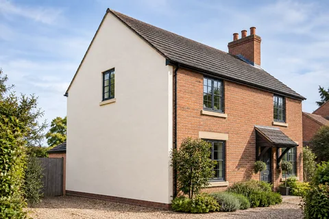
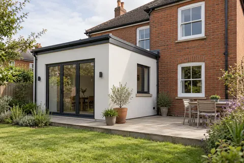
Exterior rendering
Choosing Render Colour Beside Brickwork | Beeston
The colour of a render sample changes when it is placed beside the house. Brick, mortar, roof tiles and window frames all affect how it reads, while shade changes its apparent warmth. Instead of searching for one ideal shade on a screen, narrow the choice against the materials that will remain and test it in the positions where the finish will actually be seen.

On this page
Make an honest list of the fixed materials
Begin with the parts of the building that are not changing. Include brickwork, mortar, roof covering, frames, doors, stone details and substantial paving close to the wall. Their colours may pull in different directions. The purpose of the list is not to match every item exactly, but to avoid choosing a shade that works only with the newest window frame while ignoring the rest of the building.
If a material is likely to change soon, record that separately. A temporary painted door should not necessarily drive the whole exterior palette. Likewise, an extension may be part of a longer house refurbishment. Agree which decisions are fixed now and which remain provisional so the sample discussion is not based on contradictory assumptions.
Look at the brick wall as a mixture
Most brickwork contains several tones, and the joints contribute a visible grid. Stand back far enough to see the overall effect. Then compare samples beside more than one representative part of the wall. Avoid selecting against an unusually clean patch or a dark replacement brick that does not represent the elevation as a whole.
Condition matters to this exercise. If masonry repairs or suitable cleaning are planned, understand how they may change the appearance before approving the render colour. Do not use an unverified promise that the brick will come up like new as the basis for the palette. The retained material should be assessed and any intended treatment specified on its own merits.
Compare texture before arguing over tiny shade differences
A fine textured finish and a scraped mineral render reflect and shadow light differently. Two samples with similar colour names can look quite distinct once their surfaces are visible. Establish which system is suitable, then compare colour within the proposed texture. Otherwise you may select a shade from one material and expect another to reproduce it exactly.
The silicone rendering and monocouche guides explain those different finish routes. A traditional lime surface may introduce another character again. It is possible to coordinate different materials, but the sample should show their actual relationship. A painted board can be useful for an early colour direction while remaining an incomplete representation of the final texture.

Move the sample around the building
View the shortlisted samples on the relevant elevation and, where practical, on another wall receiving different light. Look from the usual approach, across the garden and through the main windows facing the extension. A shade that feels subtle at arm’s length can occupy a large part of the view once it covers a broad wall. Scale is part of the decision.
Return at another time rather than making the entire choice during one bright visit. Overcast daylight, direct sun and shade can alter the appearance. This is a visual comparison, not evidence that a product is more weather-resistant on one elevation. Keep those aesthetic observations separate from the technical specification and its application requirements.
Compare a limited set with clear criteria
Too many nearly identical samples can make the decision harder. Shortlist a manageable number and write down what you are comparing: relationship to brick, contrast with frames, warmth in shade and visibility of the chosen texture. Ask other decision-makers to view the same samples in the same places before approving one. That reduces arguments based on different photographs or different lighting.
Record the product, shade and grain for the selected sample. If the final product changes, revisit the comparison rather than assuming a similarly named colour will behave identically. Keep the approved sample or a reliable reference with the project information. A casual message saying the second cream is acceptable can become ambiguous once several boards have moved around the site.
| Observation | What to write |
|---|---|
| Beside brick | How the shade relates to the overall masonry tone |
| Beside frames | Whether the contrast is intended |
| In shade | Whether the sample still gives the desired effect |
| At viewing distance | How the colour reads across the elevation |
| Final reference | Manufacturer, product, shade and texture |
Decide where a different colour stops
A contrasting extension needs a defined transition. A whole-house scheme may use one colour with retained brick details. In either case, mark the boundary, including returns and small strips around openings. Do not let the colour selection outrun the decisions about the extent of work. A sample cannot tell the installer which side of a pipe or corner belongs to the new finish.
Where the existing render is retained and recoloured, its texture and repairs remain relevant. The render respray guide sets out the assessment needed before decorative treatment. A pale uniform colour may make a change in texture more apparent rather than hiding it. Discuss the expected appearance of repaired areas before assuming a new coat will make every difference disappear.
Try a comparison with one variable at a time
A useful shortlist might compare three suitable shades in the same grain, rather than three colours across three unrelated textures. That makes it easier to identify why one option works better beside the brick. Once a colour direction is established, any alternative texture can be assessed deliberately. This is a comparison method, not a rule that one order of decisions suits every project.
Place the samples together briefly, then view each separately. Side-by-side contrast can exaggerate a difference that feels minor when a single finish occupies the elevation. The final decision concerns the house, not the relationship between several boards that will never be installed together.
For a hypothetical red-brick house, the owner may find one pale shade too cool in the side passage and another too strong beside a light frame. Record those observations in plain terms. Do not convert them into universal claims that red brick requires a particular undertone or that a named colour is locally preferred.
If the shortlist still feels uncertain, revisit the intended effect: quiet background, clear contrast or a close relationship with the retained materials. A decision becomes easier when the purpose is clear. Adding increasingly similar samples without agreeing that purpose can prolong the process without improving the result.
Keep colour approval separate from technical acceptance
Approving a sample confirms an appearance decision. It does not establish that the substrate is ready, that the chosen system suits the building or that all junction details have been resolved. Keep those checks in the project process. A successful colour choice is one part of a complete specification, not a replacement for it.
For the wider project, the Beeston rendering options connect the finish guides with repairs, removal and insulation. Use those pages to decide what the wall needs, then use the sample process to settle how the finished work should look. The final record should let a future reader identify both decisions without having to reconstruct them from a collection of screenshots.
Common questions
Can I choose accurately from a phone screen?
A screen is useful for narrowing ideas, but it is not a dependable colour standard. Confirm the actual product using a physical sample at the building.
Should render match the mortar?
It can relate to the mortar, brick or another retained material, but there is no universal rule. Compare the whole elevation and decide the intended relationship.
Will the same colour look identical on every wall?
Light, texture and viewing angle affect appearance. Compare the sample in the relevant positions and avoid promising visual uniformity under all conditions.
Does a sample approval guarantee a repair will disappear?
No. The shape and texture of the repaired area matter as well as colour, especially beside an aged finish.
See housing and planning information for Beeston and nearby places, including the source and geography behind each figure.